Saturday, January 07, 2006

Chat Interface

Introduction

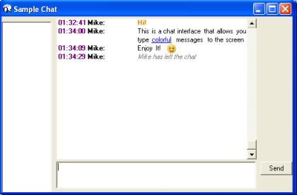
It's a hot one hear in Manhattan, but who is complaining, summer is finally here.  At least I can sit in the shade and chat.  Fortunately there is a colorful way to chat through this new chat interface using C# and .NET.  Although this chat control does not serve up a chat on a remote box, it will give you a starting point for creating fancier chat screens.  If you are curious about how to create a client-server chat application, check out the chat server written on C# Corner by Nanu or by Pramod Singh.


Figure 1 - Chat Interface

Features

This chat screen allows you to type in a pseudo-subset of html in your command line to produce bold, italic, and underlined text.  It also recognizes a few of the emoticons such as the smiley face.  The chat screen will automatically put a timestamp and user on each line and also nicely auto-indent the chat message.

The following tags are currently available in the sample.  By altering the state machine contained in the HtmlParser class, you can add additional style features:

TagDescription
<b></b>bold text
<i></i>italics
<u></u>underline
<b color=red></b>bold color attribute
:)   :-)  :-(  8-)  :-S  :-@  (N)some emoticons 

Table 1 - allowable tags in the chat control

Design

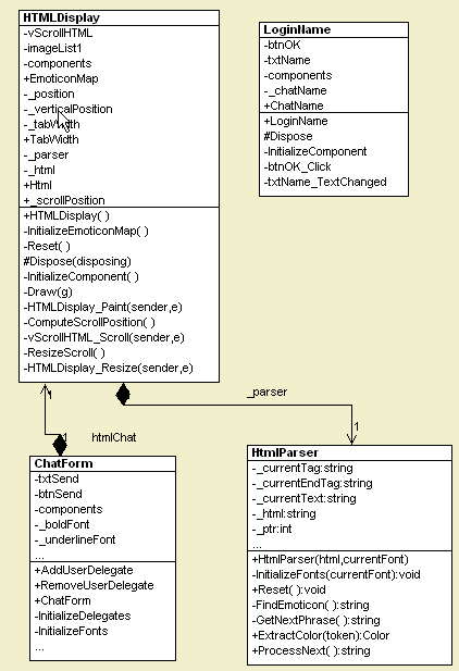
The chat interface is mainly a form containing three classes: the ChatForm which contains all the controls for sending and receiving messages on the client (Figure 1),  the user control HTMLDisplay which paints the chat messages and the HTMLParser which parses the text sent to the user control and determines colors and styles.  The UML Diagram in Figure 2 shows the relationship between these classes in the design.

Figure 2 - Chat Interface Class Diagram Reverse Engineered using WithClass UML Tool 

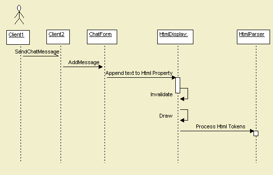
The way the interface should work in a regular client-to-client chat is that upon hitting the Send button on the chat form (client 1), the message is sent remotely and and event is listened to on the another client's form containing the message(client 2).  Upon hearing the event the client calls the ChatForm's AddMessage method to add the message to the HTMLDisplay.  AddMessage appends the message to the Html property contained in the HtmlDisplay class.  The HtmlDisplay then parses this message using the HtmlParser and paints the message according to the parsers resulting fonts, colors, and position indicators.

Figure 3 - Sequence Diagram for sending and receiving a chat message drawn in WithClass

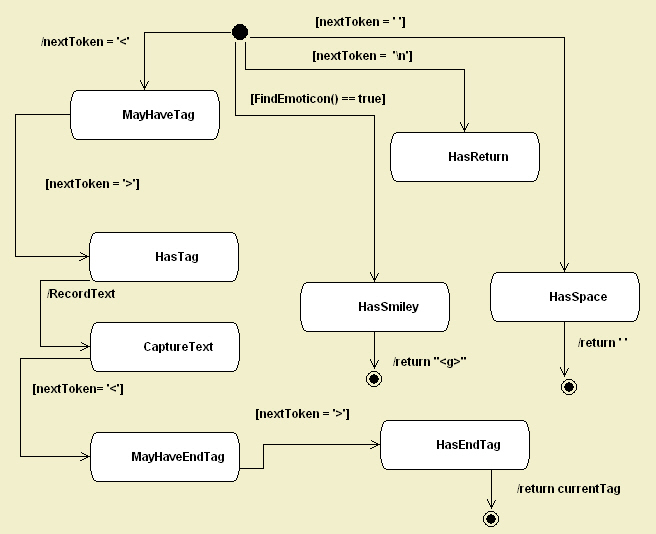
The chat interface uses a state machine contained in the HtmlParser class to parse each entry typed into the chat screen.  The state machine looks for html tags and emoticons in the message sent and changes state based on the content of the message.  When the Draw method in the Html Display it processes each token contained in the html text.  The results returned from the state machine tell the Draw routine exactly what font, color, and relative position it needs to paint the next text entry.

Figure 4 - State Diagram of Tag Parsing drawn in WithClass UML Tool

The Drawing Code

In order to better understand how the drawing of HtmlDisplay user control works, let's take a look at the Draw method of the HTMLDisplayin Listing 1.  The code begins by creating the parser that implements our state machine.  The parser loops through the entire piece of html text in the chat and picks apart the text with our parser state machine.  Each time the state machine finishes processing another sliver of text with a call to ProcessNext, it returns information to the Draw routine to tell it out to color, style and position the text.  If the state machine returns a  emoticon graphic index greater than 0, the Draw method places the proper emoticon from a stored ImageList into the calculated position in the chat window. 

Listing 1 - The Code used to Draw the Html in the HTMLDisplay

/// <summary>
/// Draws the Chat Text with proper coloring and font
/// based on the html tags and emoticons inside the text
/// </summary>
/// <param name="g"></param>
private void Draw(Graphics g)
{
// initialize local variables for drawing
Color color = Color.Black;
Font font =
null;
int pos = 0;
Brush b =
null;
bool nextLine = false;
bool last = false;
bool hasTab = false;
int smileyGraphic = 0;
try
{
// we want really smooth drawing for our chat
// speed of drawing isn't an issue here
g.SmoothingMode = SmoothingMode.AntiAlias;
// create the parser with the user control font
// and the current text of our HTMLDisplay
_parser = new HtmlParser(_html, Font);
// start the parser from the beginning
Reset();
_parser.Reset();
_scrollPosition = vScrollHTML.Value;
// keep processing the html text until we have no more
while (last == false)
{
// get the next piece of relevant text from the state machine
// along with all the text's relative font, color, and position information
string text = _parser.ProcessNext(ref font, ref color, ref nextLine, ref last, ref hasTab, ref smileyGraphic);
// create a brush to color the text
b = new SolidBrush(color);
// Calculate the length and width of the string
// in order to determine the next available text position
int stringWidth = (int)g.MeasureString(text, font).Width;
int stringHeight = (int)g.MeasureString("X", font).Height + 2;
if (_position + stringWidth > ClientRectangle.Width - vScrollHTML.Width)
{
_position = _tabWidth;
_verticalPosition += stringHeight;
}
// get clip region for smart validation
Rectangle clip = Rectangle.Truncate(g.ClipBounds);
// calculate the absolute vertical position in client coordinates
// by taking the scrollbar into account
int absoluteVerticalPosition = _verticalPosition - _scrollPosition;
// if its not an emoticon, we need to draw a string
if (smileyGraphic == 0)
{
if (_position <= clip.Right && absoluteVerticalPosition <= clip.Bottom && absoluteVerticalPosition >= clip.Top)
{
// draw the string here with the determined font, color and
// position
g.DrawString(text, font, b, _position, absoluteVerticalPosition, new StringFormat());
}
}
// track the current horizontal position
_position += (int)stringWidth;
// if the state machine determine we need to go to the next line,
// recalculate current horizontal and vertical position
if (nextLine)
{
_position = 0;
_verticalPosition += stringHeight;
}
// if the state machine determined we have a tab at the next
// token, calculate the position of the tab
if (hasTab)
{
_position = _tabWidth;
}
// handle the case where we don't have text, but an emoticon graphic
if (smileyGraphic > 0)
{
if (_position <= clip.Right && absoluteVerticalPosition <= clip.Bottom && absoluteVerticalPosition >= clip.Top)
{
// draw the emoticon bitmap image from the ImageList
g.DrawImage(imageList1.Images[smileyGraphic-1], _position, _verticalPosition - _scrollPosition, imageList1.Images[0].Width, imageList1.Images[0].Height);
}
// Shift the current position by the width of the emoticon
_position += imageList1.Images[smileyGraphic-1].Width + 2;
}
b.Dispose();
// clean up the brush resources
}
}
catch (Exception ex)
{
Console.WriteLine(ex.ToString());
}
}

Adding Emoticons

The emoticons are mapped to an image index in the image list.  Listing 2 shows  the initialization code for the emoticons in the HTMLDisplay which maps each emoticon to an image.  The emoticon text representations are all unique, so they are used as the keys in the hash table:

void InitializeEmoticonMap()
{
EmoticonMap[":)"] = 1;
EmoticonMap[":-)"] = 1;
EmoticonMap[":-("] = 2;
EmoticonMap[":("] = 2;
EmoticonMap["8-)"] = 3;
EmoticonMap[":-S"] = 4;
EmoticonMap[":-@"] = 5;
EmoticonMap["+o("] = 6;
EmoticonMap[":-|"] = 7;
EmoticonMap[";-)"] = 8;
EmoticonMap[":-#"] = 9;
EmoticonMap["(A)"] = 10;
EmoticonMap["(6)"] = 11;
EmoticonMap["(%)"] = 12;
EmoticonMap["(N)"] = 13;
EmoticonMap["(Y)"] = 14;
EmoticonMap["(P)"] = 15;
EmoticonMap[":-$"] = 16;
EmoticonMap["<:o)"] = 15;
}

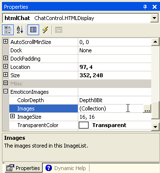
You can add your own emoticons simply by adding entries in the method above and placing the corresponding image in the image list of the HTMLDisplay. The emoticon images can be added directly to the HTMLDisplay user control through the EmoticonImages property shown in figure 5.

Figure 5 - HTMLDisplay Properties Window for adding Emoticon Images

Flashing the Chat Window

Another nice feature of the interface is that it will flash the Chat Window on the task bar if a message has been added to the chat.  This way you won't miss any urgent chat messages from your friends and colleagues. On the other hand, the flashing may eventually annoy the heck out of you, so you might want to rip it out of the code.  In any case, the flashing task bar is a standard function in the Windows SDK so we will explain how to implement it here.  The FlashWindow SDK call is slightly misleading, because it doesn't actually flash the window.  It simply inverts the window title bar and task bar color.  In order to flash the window, you have to call FlashWindow with a flag that toggles the titlebars color state in a timer.  Listing3 shows the pinvoke call for FlashWindow and an encapsulating method in the ChatForm.

Listing 3- FlashWindow SDK call implemented in C#

[DllImport("user32.dll")]
static extern bool FlashWindow(IntPtr hwnd, bool bInvert);
private void FlashWindow(bool invert)
{
FlashWindow(
this.Handle, invert);
}

Flashing the ChatForm window is accomplished by adding a timer to the ChatForm and calling FlashWindow once a second in an event handler.  Each time the event handler is called, the FlashWindow is called with the inverted boolean flag giving us our flashing effect.

bool _invert = false;
private void OnTimer(object state)
{
_invert ^=
true; /// toggle the titlebar
FlashWindow(_invert);
}

Conclusion

Sometimes you need to express yourself in more than just words.  This chat interface will help you get started in creating your own IM with fancy styles and emoticons.  You can add additional styles by altering the state machine in the HTMLParser class.  You can also add additional Emoticons by adding graphics to the ImageList and altering the EmoticonMap in the HTMLDisplay.  You may want to experiment with adding buttons to the chat form in order to make it easier for users to send their emoticons through the chat.  Anyway, feel free to chat it up with the power of C# and .NET.

Saturday, October 08, 2005

Themed Windows XP style Explorer Bar - The Code Project - C# Controls

Default XP theme

Forever Blue theme

Classic theme

OS X Panther theme

XtremeXP theme

iTunes theme

Contents

Introduction

Windows XP style Explorer Bars/Task Bars/Web Views - call them what you will - are all the rage at the moment. There are many great free Explorer Bar controls available on the net such as Derek Lakin's Collapsible Panel Bar, Darren May's Collapsing Group Control, and Tom Guinther's Full-featured XP Style Collapsible Panel. Most of them don't support Windows XP themes, or if they do, they "fake" it by drawing the gradient/arrows themselves, or by including the necessary images in the assembly.

Frustrated by this lack of proper theme support, I decided to make my own.

Features

  • Windows XP theme support - even on pre XP versions
  • Animated expand/collapse with fade effect
  • Animated show/hide of items with slide effect
  • Automatic layout of all groups and their items
  • Groups can start collapsed or expanded
  • Group re-ordering (including at design time)
  • Focus and keyboard navigation similar to Windows XP's Explorer Bar
  • User defined settings - gradients, colors, borders and more
  • Supports .NET Framework versions 1.0 and 1.1
  • Supports Binary and XML Serialization

Themes

So, how can we make use of themes?

My first attempt was to take screenshots of the real Explorer Bar in action so I could get the images and colors that I would need. This worked well as long as I only used the Luna themes that come with XP. I was forced to go back to the drawing board.

After stumbling across Don Kackman's article on Adding XP Themes to Custom .NET Controls, attempt #2 was to make use of UxTheme.dll. That was until I got to the part where using UxTheme worked as long as you only used the default Blue Luna theme. However, Don came up with a potential solution - get the necessary information from ShellStyle.dll.

ShellStyle.dll

Now that I knew where to look, the question was "what am I looking for?" TGTSoft (the makers of StyleXP) have a great free program called ResBuilder that allows you to open and modify Windows resource files. Armed with this program, I was able to have a poke around inside ShellStyle.dll.

ShellStyle.dll in ResBuilder

Figure 1: ShellStyle.dll in ResBuilder

The sections I needed were the Bitmap (obviously) and the UIFILE - more on these later.

Before loading the ShellStyle.dll, we need to check whether themes are available:

// check if we are using themes. if so, load up the// appropriate shellstyle.dllif (UxTheme.AppThemed && LoadShellStyleDll()){   ...

If they are available, then go ahead and load the ShellStyle.dll:

////// Loads the ShellStyle.dll into memory as determined by the current/// system theme///private static bool LoadShellStyleDll(){   // work out the path to the shellstyle.dll according   // to the current theme   string themeName = UxTheme.ThemeName.Substring(0,                       UxTheme.ThemeName.LastIndexOf('\\'));   string styleName = themeName + "\\Shell\\" + UxTheme.ColorName;   string stylePath = styleName + "\\shellstyle.dll";   // if for some reason it doesn't exist, use the default    // shellstyle.dll in the windows\system32 directory   if (!File.Exists(stylePath))   {      stylePath = Environment.GetFolderPath(Environment.SpecialFolder.System) +                                             "\\shellstyle.dll";   }   // attempt to load the shellstyle dll   hModule = LoadLibrary(stylePath);   // return whether we succeeded   return (hModule != IntPtr.Zero);}

The UIFILE

So, what is a UIFILE? The UIFILE is basically a style sheet that tells the Explorer Bar how it should render itself. Below is a small section that shows settings for a special group's titlebar for the Blue Luna theme:

button [id=atom(header)]{   background: rcbmp(110,6,#FF00FF,0,0,1,0);   borderthickness: rect(2,2,2,0);   foreground: white;   fontweight: rcint(10);   padding: rect(10,0,0,0);   animation: rectanglev | s | fast;}

(For more information on UIFILEs, bfarber.com has a tutorial on how to read a UIFILE).

You'll notice that there are two UIFILEs - the first one is for the Explorer Bar, and the second is for the Control Panel. Now that we know which one we want, it is time to read its contents:

////// Extracts the UIFILE from the currently loaded ShellStyle.dll///public static string GetResourceUIFile(){   // locate the "UIFILE" resource   IntPtr hResource = FindResource(hModule, "#1", "UIFILE");   // get its size   int resourceSize = SizeofResource(hModule, hResource);   // load the resource   IntPtr resourceData = LoadResource(hModule, hResource);   // copy the resource data into a byte array so we   // still have a copy once the resource is freed   byte[] uiBytes = new byte[resourceSize];   GCHandle gcHandle = GCHandle.Alloc(uiBytes, GCHandleType.Pinned);   IntPtr firstCopyElement = Marshal.UnsafeAddrOfPinnedArrayElement(uiBytes, 0);   CopyMemory(firstCopyElement, resourceData, resourceSize);   // free the resource   gcHandle.Free();   FreeResource(resourceData);   // convert the char array to an ansi string   string s = Marshal.PtrToStringAnsi(firstCopyElement, resourceSize);   return s;}

Extracting Bitmaps

All bitmaps in the UIFILE have the following format:

rcbmp(id, stretching, transparency, width, height, size, mirror)

To load a bitmap, we just pass the bitmap ID to the GetResourceBMP method:

////// Returns a Bitmap from the currently loaded ShellStyle.dll///public static Bitmap GetResourceBMP(string resourceName){   // find the resource   IntPtr hBitmap = LoadBitmap(hModule, Int32.Parse(resourceName));   // load the bitmap   Bitmap bitmap = Bitmap.FromHbitmap(hBitmap);   return bitmap;}

The method above works for ordinary bitmaps, but we run into a major problem if the image is a 32bpp PNG - the alpha channel is lost, leaving black areas where the transparency should be.

Alpha channel comparison

Figure 2: Alpha channel comparison

The following solution to this problem was posted on Derek Lakin's blog:

////// Returns a Png Bitmap from the currently loaded ShellStyle.dll///public static Bitmap GetResourcePNG(string resourceName){   // the resource size includes some header information    // (for PNG's in shellstyle.dll this appears to be the    // standard 40 bytes of BITMAPHEADERINFO).   const int FILE_HEADER_BYTES = 40;   // load the bitmap resource normally to get dimensions etc.   Bitmap tmpNoAlpha = Bitmap.FromResource(hModule, "#" + resourceName);   IntPtr hResource = FindResource(hModule, "#" + resourceName,                                    (IntPtr) 2 /*RT_BITMAP*/);   int resourceSize = SizeofResource(hModule, hResource);   // initialise 32bit alpha bitmap (target)   Bitmap bitmap = new Bitmap(tmpNoAlpha.Width,                               tmpNoAlpha.Height,                               PixelFormat.Format32bppArgb);   // load the resource via kernel32.dll (preserves alpha)   IntPtr hLoadedResource = LoadResource(hModule, hResource);   // copy bitmap data into byte array directly   byte[] bitmapBytes = new byte[resourceSize];   GCHandle gcHandle = GCHandle.Alloc(bitmapBytes, GCHandleType.Pinned);   IntPtr firstCopyElement =         Marshal.UnsafeAddrOfPinnedArrayElement(bitmapBytes, 0);   // nb. we only copy the actual PNG data (no header)   CopyMemory(firstCopyElement, hLoadedResource, resourceSize);   FreeResource(hLoadedResource);   // copy the byte array contents back   // to a handle to the alpha bitmap (use lockbits)   Rectangle copyArea = new Rectangle(0, 0, bitmap.Width, bitmap.Height);   BitmapData alphaBits = bitmap.LockBits(copyArea,                                           ImageLockMode.WriteOnly,                                           PixelFormat.Format32bppArgb);   // copymemory to bitmap data (Scan0)   firstCopyElement = Marshal.UnsafeAddrOfPinnedArrayElement(bitmapBytes,                                                         FILE_HEADER_BYTES);   CopyMemory(alphaBits.Scan0, firstCopyElement,                   resourceSize - FILE_HEADER_BYTES);   gcHandle.Free();   // complete operation   bitmap.UnlockBits(alphaBits);   GdiFlush();   // flip bits (not sure why this is needed at the moment..)   bitmap.RotateFlip(RotateFlipType.RotateNoneFlipY);   return bitmap;}

So, how do we know which one to use for each image? Generally speaking, normal bitmaps will use a hexadecimal transparency value, while PNGs will use an integer value.

...// if the transparency value starts with a #, then the image is// a bitmap, otherwise it is a 32bit pngif (transparent.StartsWith("#")){   // get the bitmap   image = Util.GetResourceBMP(id);   ...}else{   // get the png   image = Util.GetResourcePNG(id);}...

XPExplorerBar

The XPExplorerBar consists of three main components:

  1. The TaskPane
  2. Expandos, and
  3. TaskItems

I won't go into great detail about how each of these were implemented as that is what the source code is for, but I will give an insight into some of the more interesting features such as animation.

Using XPExplorerBar

Before using the XPExplorerBar, you need to add a reference to XPExplorerBar.dll in the References section of your project.

To add the XPExplorerBar.dll to the toolbox, you can either:

  1. Select Tools -> Add/Remove Toolbox Items from the menu, or
  2. Right click on the toolbox, select Add/Remove Items.

and browse for XPExplorerBar.dll and then press OK. You can then drag the controls onto your Form.

Note: If you recompile the source code you will need to re-sign XPExplorerBar.dll, as otherwise Visual Studio will throw an exception when you attempt to add it to the toolbox.

  1. Open up the VS.NET command prompt and change the directory to point to the XPExplorerBar\bin\Release directory.
  2. Then type "sn -R XPExplorerBar.dll ..\..\XPExplorerBar.snk" (without the quotes of course).

You should then be able to add it to the toolbox.

TaskPane

The TaskPane acts as a container for all the Expandos that the XPExplorerBar will contain.

  • Expandos

    An ExpandoCollection representing the collection of Expandos contained within the TaskPane.

  • CustomSettings

    The custom settings used to draw the TaskPane.

    Note: Changing one of these settings will override the same system setting defined in a shellstyle.dll.

Adding Expandos to a TaskPane

There are two ways to add Expandos to a TaskPane:

  • Via the Expandos property in the property editor window, or
  • Dragging Expandos from the toolbox onto a TaskPane

Adding Expandos with the property editor

Figure 3: Adding Expandos with the property editor

Reordering Expandos

During design time, you can use the up and down arrow buttons in the Expando Collection Editor to reorder the Expandos.

Use arrow buttons to reorder Expandos at design time

Figure 4: Use arrow buttons to reorder Expandos at design time

At all other times, the TaskPane's Expandos property provides the following methods to reorder Expandos:

  • Move(Expando value, int index)

    Moves the specified Expando to the specified indexed location in the ExpandoCollection.

  • MoveToTop(Expando value)

    Moves the specified Expando to the top of the ExpandoCollection.

  • MoveToBottom(Expando value)

    Moves the specified Expando to the bottom of the ExpandoCollection.

// Move an Expando to the top of the TaskPanetaskpane.Expandos.MoveToTop(expando);

Using Themes Other Than The Current Theme

The XPExplorerBar also allows you to use themes that are different to the current theme.

  • UseClassicTheme()

    Forces the TaskPane and all its Expandos to use a theme equivalent to Windows XP's Classic Theme (this is the default theme on Windows 2000 or earlier).

  • UseCustomTheme(string stylePath)

    Forces the TaskPane and all its Expandos to use the specified theme.

  • UseDefaultTheme()

    Forces the TaskPane and all its Expandos to use the current system theme.

UseClassicTheme() and UseDefaultTheme() will appear to do the same thing on Windows versions prior to XP, or on XP machines with themes disabled. Note that UseCustomTheme() will work on Windows 2000 or earlier.

TaskPane taskpane = new TaskPane();// foreverblue.dll lives in the same directory as// the executable. if it were somewhere else, we// would need to use "path/to/foreverblue.dll"taskpane.UseCustomTheme("foreverblue.dll");

XPExplorerBar demo with Windows XP theme Forever Blue on Windows 2000

Figure 5: XPExplorerBar demo with Windows XP theme Forever Blue on Windows 2000

Custom themes can be found at ThemeXP.

Collapsing/Expanding Multiple Expandos

The XPExplorerBar now allows you to expand or collapse multiple Expandos at the same time.

  • CollapseAll()

    Collapses all the Expandos contained in the TaskPane.

  • ExpandAll()

    Expands all the Expandos contained in the TaskPane.

  • CollapseAllButOne(Expando expando)

    Collapses all the Expandos contained in the TaskPane, except for the specified Expando which is expanded.

Expando

Expandos are containers for TaskItems and other Controls, and can be collapsed/expanded as necessary. Note that Expandos will only animate if they are added to a TaskPane.

I'm sure that right about now, you're wondering where I got the name Expando from. If you look at the UIFILE, you will get an idea (it's the name Microsoft has given the collapsible group).

  • Animate

    Determines whether the Expando will perform collapse/expand or show/hide animations.

  • AutoLayout

    Determines whether the Expando will automagically layout its items.

  • Collapsed

    Determines whether the Expando is collapsed or expanded.

  • CustomSettings

    The custom settings used to draw the Expando's body.

    Note: Changing one of these settings will override the same system setting defined in a shellstyle.dll.

  • CustomHeaderSettings

    The custom settings used to draw the Expando's title bar.

    Note: Changing one of these settings will override the same system setting defined in a shellstyle.dll.

  • ExpandedHeight

    Sets the height of the Expando in its expanded state. This is ignored if the AutoLayout property is used.

  • Items

    An ItemCollection representing the collection of Controls contained within the Expando.

  • ShowFocusCues

    Gets or sets a value indicating whether the Expando should display focus rectangles when it has focus.

  • SpecialGroup

    Determines whether the Expando will be rendered as a Special Group.

  • TitleImage

    Specifies the Image that is displayed on the left side of the Expando's titlebar.

Adding Controls to an Expando

There are two ways to add Controls to an Expando:

  • Via the Items property in the property editor window, or
  • Dragging Controls from the toolbox onto an Expando.

Adding Controls with the property editor

Adding Controls with the property editor

Figure 6a (top) and 6b (bottom): Adding Controls with the property editor.

Version 3.0 now allows other Controls besides TaskItems to be added via the Items property in the designer. Clicking the Add button will add a TaskItem to the Expando, while clicking the arrow next to the Add button will provide a list of the more useful Controls to add to the Expando.

Reordering Controls

During design time, you can use the up and down arrow buttons in the Control Collection Editor to reorder the Controls.

Use arrow buttons to reorder Controls at design time

Figure 7: Use arrow buttons to reorder Controls at design time

At all other times, the Expando's Items property provides the following methods to reorder Controls:

  • Move(Control value, int index)

    Moves the specified Control to the specified indexed location in the ItemCollection.

  • MoveToTop(Control value)

    Moves the specified Control to the top of the ItemCollection.

  • MoveToBottom(Control value)

    Moves the specified Control to the bottom of the ItemCollection.

// Move a TaskItem to the top of the Expandoexpando.Items.MoveToTop(taskitem);

As of v3.3 Expandos can now be dragged around a TaskPane. For this to happen the TaskPane's AllowExpandoDragging property should be set to true.

Dragging Expandos

Figure 8: Dragging Expandos around a TaskPane

Hide/Show Controls

In order to hide or show items, the HideControl and ShowControl methods have been provided. You shouldn't use control.Visible = false to hide items, as the Expando will need to make the control visible again in order to perform an expand animation without any visual artifacts (such as a black background for some themed controls), most likely causing the control to stay visible when it should be hidden, as well as cause a few layout headaches.

  • HideControl(Control control)

    Hides the specified Control.

  • HideControl(Control[] controls)

    Hides the specified array of Controls.

  • ShowControl(Control control)

    Shows the specified Control.

  • ShowControl(Control[] controls)

    Shows the specified array of Controls.

Note: In order for the Expando to perform an animation, the Expando's AutoLayout and Animate properties must all be true.

Note: As of version 3.3 you can batch HideControl/ ShowControl commands using the BeginUpdate()/ EndUpdate() methods:

// stop the following slide animation // commands from being performedexpando.BeginUpdate();expando.HideControl(new Control[] {taskItem1, taskItem2});expando.ShowControl(taskItem3);// now perform the animationsexpando.EndUpdate();

Note: At the moment the BeginUpdate()/EndUpdate() methods are only useful for this purpose.

Docking and Scrolling

A docked scrollable Panel

Figure 9: A docked scrollable Panel

As of version 3.0, Expandos no longer support scrolling. The way that scrolling was implemented in version 2.x caused a few rendering problems that I have yet to resolve. Hopefully by removing scroll support in this version I will have more time to fix the problems, and add scrolling support back in a future version (as opposed to delaying releases). Apologies for any inconvenience this may cause.

To add scrolling, simply add a scrollable Panel and set its DockStyle property to Fill.

To stop child controls from covering the title bar and borders when docked, I overrode the Expando's DisplayRectangle property.

////// Overrides DisplayRectangle so that docked controls/// don't cover the titlebar or borders/// public override Rectangle DisplayRectangle{   get   {      return new Rectangle(this.Border.Left,                            this.HeaderHeight + this.Border.Top,                           this.Width - this.Border.Left - this.Border.Right,                           this.ExpandedHeight - this.HeaderHeight -                            this.Border.Top - this.Border.Bottom);   }}

Animation

Animated collapse in action

Figure 10: Animated collapse in action

To enable collapse/expand animation, the Expando's Animate property must be set to true:

/// Gets or sets whether the Expando is allowed to animate.public bool Animate{   get   {      return this.animate;   }   set   {      this.animate = value;   }}

When the Expando's Collapsed property changes, it checks whether it can animate.

/// Gets or sets whether the Expando is collapsed.public bool Collapsed{   ...   set   {      if (this.collapsed != value)      {         // if we're supposed to collapse, check if we can         if (value && !this.CanCollapse)         {            // looks like we can't so time to bail            return;         }         this.collapsed = value;         // only animate if we're allowed to, we're not in          // design mode and we're not initialising         if (this.Animate && !this.DesignMode && !this.Initialising)         {            ...

If the Expando is able to animate, it creates a new AnimationHelper that tells the Expando to get ready and starts the animation timer.

            ...            this.animationHelper = new AnimationHelper(this,                                    AnimationHelper.FadeAnimation);            this.OnStateChanged(new ExpandoEventArgs(this));            this.animationHelper.StartAnimation();            ...         }      }   }}////// Starts the animation for the specified expando/// protected void StartAnimation(){   // don't bother going any further if we are already animating   if (this.Animating)   {      return;   }   this.animationStepNum = 0;   // tell the expando to get ready to animate   if (this.AnimationType == FadeAnimation)   {      this.expando.StartFadeAnimation();   }   else   {      this.expando.StartSlideAnimation();   }   // start the animation timer   this.animationTimer.Start();}

Once the Expando receives the StartAnimation message, it takes a "snap-shot" of its "client area" (i.e., its dockable area). All the Expando's child controls are set invisible as otherwise they would appear to slide off the bottom of the Expando (also controls that have their FlatStyle property set to System don't like having their opacity changed).

////// Gets the Expando ready to start its collapse/expand animation/// protected void StartAnimation(){   this.animating = true;   // stop the layout engine   this.SuspendLayout();   // get an image of the client area that we can   // use for alpha-blending in our animation   this.animationImage = this.GetAnimationImage();   // set each control invisible (otherwise they   // appear to slide off the bottom of the group)   foreach (Control control in this.Controls)   {      control.Visible = false;   }   // restart the layout engine   this.ResumeLayout(false);}/// /// Returns an image of the group's display area to be used/// in the animation/// internal Image GetAnimationImage(){   // create a new image to draw into   Image image = new Bitmap(this.Width, this.Height);      // get a graphics object we can draw into   Graphics g = Graphics.FromImage(image);   IntPtr hDC = g.GetHdc();   // some flags to tell the control how to draw itself   IntPtr flags = (IntPtr) (WmPrintFlags.PRF_CLIENT |                             WmPrintFlags.PRF_CHILDREN |                             WmPrintFlags.PRF_ERASEBKGND);   // tell the control to draw itself   NativeMethods.SendMessage(this.Handle,                              WindowMessageFlags.WM_PRINT,                              hDC, flags);   // clean up resources   g.ReleaseHdc(hDC);   g.Dispose();   // return the completed animation image   return image;}////// The SendMessage function sends the specified message to a /// window or windows. It calls the window procedure for the /// specified window and does not return until the window /// procedure has processed the message///[DllImport("User32.dll")] internal static extern int SendMessage(IntPtr hwnd,                                        int msg,                                        IntPtr wParam,                                        IntPtr lParam);

The animationImage is faded and moved up/down as necessary during the animation.

/// /// Paints the "Display Rectangle". This is the dockable/// area of the control (ie non-titlebar/border area). /// protected void PaintDisplayRect(Graphics g){   // are we animating   if (this.animating && this.animationImage != null)   {      // calculate the transparency value for the animation image      float alpha = (((float) (this.Height - this.HeaderHeight)) /                      ((float) (this.ExpandedHeight - this.HeaderHeight)));      float[][] ptsArray = {new float[] {1, 0, 0, 0, 0},                            new float[] {0, 1, 0, 0, 0},                            new float[] {0, 0, 1, 0, 0},                            new float[] {0, 0, 0, alpha, 0},                             new float[] {0, 0, 0, 0, 1}};       ColorMatrix colorMatrix = new ColorMatrix(ptsArray);      ImageAttributes imageAttributes = new ImageAttributes();      imageAttributes.SetColorMatrix(colorMatrix,                                      ColorMatrixFlag.Default,                                      ColorAdjustType.Bitmap);      // work out how far up the animation image we need to start      int y = this.animationImage.Height - this.PseudoClientHeight               - this.Border.Bottom;      // draw the image      g.DrawImage(this.animationImage,                  new Rectangle(0, this.HeaderHeight, this.Width,                                 this.Height - this.HeaderHeight),                  0,                  y,                  this.animationImage.Width,                   this.animationImage.Height - y,                  GraphicsUnit.Pixel,                  imageAttributes);   }   else   {      ...   }}

TaskItem

A TaskItem

Figure 11: A TaskItem

TaskItems are similar to Labels. Each TaskItem can contain an Image that is restricted to 16x16 pixels. Larger or smaller images can be used, but they will be enlarged/decreased to 16x16 as necessary.

  • CustomSettings

    The custom settings used to draw the TaskItem.

    Note: Changing one of these settings will override the same system setting defined in a shellstyle.dll.

  • Image

    The image that is displayed on a TaskItem.

  • ShowFocusCues

    Gets or sets a value indicating whether the TaskItem should display focus rectangles when it has focus.

Points of Interest

Serialization

As of v3.2, Binary Serialization support has been reworked and XML Serialization support has been added.

Note: v3.2.1 adds a Version property to the serialization process to ensure backward compatibility with future versions. Anyone using serialization is encouraged to upgrade to v3.2.1

In order to fix the problems that v3.1 had with serialization, I needed to find a new way to perform serialization. After much Googling, I came across the concept of surrogates. A surrogate is a class that will be serialized in place of another class (usually because the other class is either not serializable or contains classes that are not serializable or cause serialization problems).

  • TaskPane.TaskPaneSurrogate

    A class that is serialized instead of a TaskPane.

  • Expando.ExpandoSurrogate

    A class that is serialized instead of an Expando.

  • TaskItem.TaskItemSurrogate

    A class that is serialized instead of a TaskItem.

All the above Surrogates have the following methods for importing/exporting data to/from a Surrogate:

  • Load(object value)

    Populates the Surrogate with data that is to be serialized from the specified object.

  • Save()

    Returns an object that contains the deserialized Surrogate data.

The example below shows how a TaskPane can be serialized and deserialized by a TaskPane.TaskPaneSurrogate with Binary and XML serialization:

// BINARY SERIALIZATION// serialize a TaskPane to a fileIFormatter formatter = new BinaryFormatter();stream = new FileStream("TaskPane.bin", FileMode.Create, FileAccess.Write,                                                          FileShare.None);TaskPane.TaskPaneSurrogate taskPaneSurrogate =                                         new TaskPane.TaskPaneSurrogate(); taskPaneSurrogate.Load(this.serializeTaskPane);formatter.Serialize(stream, taskPaneSurrogate);stream.Close();// deserialize a TaskPane from a fileIFormatter formatter = new BinaryFormatter();stream = new FileStream("TaskPane.bin", FileMode.Open, FileAccess.Read,                                                        FileShare.Read);TaskPane.TaskPaneSurrogate taskPaneSurrogate =               (TaskPane.TaskPaneSurrogate) formatter.Deserialize(stream);TaskPane taskpane = taskPaneSurrogate.Save();stream.Close();// XML SERIALIZATION// serialize a TaskPane to a fileXmlSerializer xml = new XmlSerializer(typeof(TaskPane.TaskPaneSurrogate));StreamWriter writer = new StreamWriter("TaskPane.xml");TaskPane.TaskPaneSurrogate taskPaneSurrogate =                                         new TaskPane.TaskPaneSurrogate(); taskPaneSurrogate.Load(this.serializeTaskPane);                        xml.Serialize(writer, taskPaneSurrogate);writer.Close();// deserialize a TaskPane from a fileXmlSerializer xml = new XmlSerializer(typeof(TaskPane.TaskPaneSurrogate));TextReader reader = new StreamReader("TaskPane.xml");TaskPane.TaskPaneSurrogate taskPaneSurrogate =                      (TaskPane.TaskPaneSurrogate) xml.Deserialize(reader);TaskPane taskpane = taskPaneSurrogate.Save();reader.Close();

Note: Controls in the Expando.ItemCollection that are not TaskItems are ignored during the serialization process as (unfortunately) they do not support serialization.

Visual Styles and WM_PRINT

Update: I sent a bug report to Microsoft about visual styles and WM_PRINT messages (which can be found here[^]) and their response was basically that it would be too hard to fix, so it looks like we're stuck with this workaround until Avalon is released.

Some XP themed controls (TextBox, ListView, TreeView, ListBox, CheckedListBox, DateTimePicker, GroupBox) don't draw a themed border when sent a WM_PRINT message, if Visual Styles are enabled.

TextBox border after WM_PRINT message

Figure 12: TextBox border after WM_PRINT message

In order to solve this problem, I immediately ran into another problem - How to find out if Visual Styles are applied (i.e., a manifest or Application.EnableVisualStyles() is being used). After some Googling, I found this solution which checks if themes are enabled and which version of the Common Controls is being used:

////// Checks whether Visual Styles are enabled///protected bool VisualStylesEnabled{   get   {      OperatingSystem os = System.Environment.OSVersion;      // check if the OS is XP or higher      if (os.Platform == PlatformID.Win32NT &&          ((os.Version.Major == 5 && os.Version.Minor >= 1) ||            os.Version.Major > 5))      {         // are themes enabled         if (UxTheme.IsThemeActive() && UxTheme.IsAppThemed())         {            DLLVERSIONINFO version = new DLLVERSIONINFO();            version.cbSize = Marshal.SizeOf(typeof(DLLVERSIONINFO));            // are we using Common Controls v6            if (DllGetVersion(ref version) == 0)            {               return (version.dwMajorVersion > 5);            }         }      }      return false;   }}////// Receives dynamic-link library (DLL)-specific version information. /// It is used with the DllGetVersion function///[StructLayout(LayoutKind.Sequential)]public struct DLLVERSIONINFO{   public int cbSize;   public int dwMajorVersion;   public int dwMinorVersion;   public int dwBuildNumber;   public int dwPlatformID;}////// Implemented by many of the Microsoft Windows Shell dynamic-link libraries /// (DLLs) to allow applications to obtain DLL-specific version information///[DllImport("Comctl32.dll")] public static extern int DllGetVersion(ref DLLVERSIONINFO pdvi);

I then subclassed the offending controls and listened for WM_PRINT messages, and drew themed borders over the top of the unthemed borders, if Visual Styles are enabled.

////// Processes Windows messages///protected override void WndProc(ref Message m){   base.WndProc(ref m);   // don't bother if visual styles aren't applied   if (!this.visualStylesEnabled)   {      return;   }   // WM_PRINT message?   if (m.Msg == (int) WindowMessageFlags.WM_PRINT)   {      // are we supposed to draw the nonclient area?      // (ie borders)      if ((m.LParam.ToInt32() & (int) WmPrintFlags.PRF_NONCLIENT) ==           (int) WmPrintFlags.PRF_NONCLIENT)      {         // open theme data         IntPtr hTheme = UxTheme.OpenThemeData(this.Handle,                                                UxTheme.WindowClasses.Edit);         if (hTheme != IntPtr.Zero)         {            // get the part and state needed            int partId = (int) UxTheme.Parts.Edit.EditText;            int stateId = (int) UxTheme.PartStates.EditText.Normal;            // rectangle to draw into            RECT rect = new RECT();            rect.right = this.Width;            rect.bottom = this.Height;            // clipping rectangle            RECT clipRect = new RECT();            // draw the left border            clipRect.left = rect.left;            clipRect.top = rect.top;            clipRect.right = rect.left + 2;            clipRect.bottom = rect.bottom;            UxTheme.DrawThemeBackground(hTheme, m.WParam, partId, stateId,                                         ref rect, ref clipRect);            // do the same for other borders            ...         }         UxTheme.CloseThemeData(hTheme);      }   }}

The subclassed controls (XPTextBox, XPListView, XPTreeView, XPListBox, XPCheckedListBox, XPDateTimePicker) are included in the download.

Known Problems

  • XPExplorerBar may not correctly render non-official XP themes.

History

  • 30 September 2005 - Version 3.3
    • Added RightToLeft support for Expandos and TaskItems.
    • Added ability to batch HideControl/ShowControl commands for Expandos (see Hide/Show Controls for more details).
    • Added ability for Expandos to be dragged around a TaskPane.
    • Fixed TaskItem's text is sometimes clipped.
    • Other bug fixes.
  • 24 February 2005 - Version 3.2.1.2
    • Fixed Expando Hide/ShowControl methods trying to animate while Expando is collapsed.
    • Changed UseDefaultTabHandling property so that the default focus and keyboard navigation is enabled by default. To use tab handling similar to Windows XP's Explorer Bar UseDefaultTabHandling must be explicitly set to false.
  • 17 February 2005 - Version 3.2.1.1
    • Removed excess Serializable attributes from classes which shouldn't be serialized.
    • Added UseDefaultTabHandling property to Expandos so the user can choose the default focus and keyboard navigation or use focus and keyboard navigation similar to Windows XP's Explorer Bar.
  • 22 January 2005 - Version 3.2.1
    • Added Version property for serialization to ensure backward compatibility with future versions.
    • Other bug fixes.
  • 19 January 2005 - Version 3.2
    • Changed the way Binary Serialization works and added XML serialization support.
    • Fixed can't extract images from shellstyle.dlls on Windows 9x bug.
    • Fixed "Resource transformation for file 'Myfile.resx' failed" bug.
    • Improved theme support.
    • Other bug fixes.
  • 2 November 2004 - Version 3.1
    • Added Binary Serialization support for TaskPanes, Expandos, TaskItems, TaskPane.ExpandoCollections and Expando.ItemCollections.
    • Fixed can't add TaskItems or other controls to Expandos programmatically bug which was accidentally reintroduced in v3.0.
    • Other bug fixes.
  • 25 October 2004 - Version 3.0
    • Added custom settings for TaskPanes, Expandos and TaskItems.
    • Removed native scrolling support for Expandos due to rendering issues.
    • Fixed Expandos start at point (0, 0) when added to a TaskPane programmatically bug.
    • Fixed Expandos start with incorrect height if Collapsed and have a TitleImage bug.
    • Other bug fixes
  • 11 October 2004 - Version 2.1
    • Changed Expandos so that collapse/expand arrows and titlebar highlights are not displayed when the CanCollapse property is false.
  • 30 September 2004 - Version 2.0
    • Added native scrolling support for Expandos.
    • Added focus and keyboard navigation similar to Windows XP's Explorer Bar.
    • Fixed bug: can't add Expandos, TaskItems or other controls programmatically.
  • 3 September 2004 - Version 1.4
    • Added Control re-ordering on Expandos.
  • 26 August 2004 - Version 1.3
    • Added Expando re-ordering.
  • 21 August 2004 - Version 1.21
    • Expandos titlebar now rendered in grayscale when disabled.
    • TaskItems render their text the same as a Label when disabled.
    • Improved theme support.
  • 5 August 2004 - Version 1.2
    • Changed name from XPTaskBar to XPExplorerBar.
    • Added show/hide animation.
    • Improved theme support.
  • 3 June 2004 - Version 1.1
    • Added collapse/expand multiple Expandos.
    • Added custom XP theme support.
  • 31 May 2004 - Initial release.

Posted using illegal copy of BlogJet.
Please purchase a license here.
Wednesday, October 05, 2005

Demonstrates how to produce XP Explorer-style icon highlighting effects using managed and unmanaged code

Highlighting and Shadowing Image List Images

Demonstrates how to produce XP Explorer-style icon highlighting effects using managed and unmanaged code.

Icon Highlighting Sample

For some reason, the System.Windows.Forms.ImageList does not provide a Draw method that allows an image to be drawn highlighted or selected, even though this is part of the basic functionality of the underlying ComCtl32 ImageList. This article provides a method of drawing selected and lightened images using Managed Code and also describes how to do it using unmanaged methods.

Highlighting Icons with Managed Code

There are two techniques you can use from Managed Code to create highlighting type effects:

  1. Gamma Correction.
  2. Alpha Blending.

I'll cover these in turn.

Gamma Correction

Gamma correction was developed to make it easier to adjust colours displayed on Cathode Ray Tube (CRT) displays. CRT displays produce a light intensity (luminance) proportional to the input voltage raised to a power. Since no two CRTs are exactly alike in their luminance characteristic, a way of adjusting the input image so the displayed colours match a reference is needed. This is done by adjusting the colours to be displayed by a power which is termed gamma.

Since gamma lightens or darkens the colours in an image it can be used for image processing effects as well as the normal colour profile adjustment. Gamma is normally restricted to the range 1/5 to 5, where a value less than 1 lightens the image, a value of 1 leaves the image unaffected and an value greater than 1 darkens the image:

The effects of modifying gamma.

Effects of modifying gamma.

Gamma correction in the .NET framework is provided by using the ImageAttributes class from the System.Drawing.Imaging namespace. Here's an example of how to use it to draw an image in VB.NET:

   ' Set up the gamma:   Dim imageAttr As System.Drawing.Imaging.ImageAttributes = _       New System.Drawing.Imaging.ImageAttributes()   imageAttr.SetGamma(0.5)   ' Draw the image with the gamma applied:   Dim img As Image = iconImageList.Images(iconIndex)   graphics.DrawImage( _       img, _       destRect, _       1, 1, iconImageList.ImageSize.Width, iconImageList.ImageSize.Height, _       GraphicsUnit.Pixel, imageAttr)   ' Done.   imageAttr.Dispose()

Alpha Blending

As the .NET Framework drawing code is based on GDI+, all drawing can take advantage of alpha blending. Unfortunately, there are two problems with this in terms of highlighting an icon:

  1. Icons and alpha
    Icons often aren't represented the way you would like them to be to take best advantage of transparency. You might hope that the transparent area of an icon would be represented as an area where the alpha channel was set to 0 (fully transparent). However, this generally isn't the case and instead the draw routines for icons hack the transparent area by using boolean operations and the mask image of the icon. Personally I think it would make a lot of sense if future versions of the NET Framework dropped the idea of an icon completely and instead converted native Win32 icons into an alpha-bitmap.
  2. Compositing limitations.
    To highlight an icon with a colour, what you want to be able to do is to draw a translucent colour over the top of the icon but not where the icon is transparent. This is the Porter-Duff dst_atop compositing operation, which isn't directly supported by the .NET Framework which currently only supports src and src_over in the CompositingMode enumeration.

Despite these limitations, it's possible to hack things to highlight just the coloured area of an icon. The technique works as follows:

  1. Create an offscreen work bitmap to create the colourised image.
  2. Draw the icon over a background colour that's unlikely to occur in any of your icons.
  3. Paint over the entire offscreen bitmap with the translucent colour to highlight the icon with.
  4. Draw the offscreen image onto the target using the colour remap table feature of the ImageAttributes class.

Here's the VB.NET code which achieves this:

   ' Create an offscreen bitmap for working on.  This is one bigger than   ' the icon so we know for sure that the top row of pixels will be   ' transparent   Dim bm As Bitmap = New Bitmap( _       iconImageList.ImageSize.Width, iconImageList.ImageSize.Height + 1 _       )   Dim gfx As Graphics = graphics.FromImage(bm)   ' Set the background colour to a colour that "won't" appear in the icon:   Dim br As Brush = New SolidBrush(Color.FromArgb(254, 253, 254))   gfx.FillRectangle(br, 0, 0, bm.Width, bm.Height)   br.Dispose()   ' Draw the icon starting at the second row in the bitmap:   iconImageList.Draw(gfx, 0, 1, iconIndex)   ' Overdraw with the highlight colour:   br = New SolidBrush(Color.FromArgb(highlightAmount, highlightColor))   gfx.FillRectangle(br, 0, 0, bm.Width, bm.Height)   br.Dispose()   gfx.Dispose()   ' Now set up a colour mapping from the colour of the pixel   ' at 0,0 to transparent:   Dim imageAttr As System.Drawing.Imaging.ImageAttributes = _       New System.Drawing.Imaging.ImageAttributes()   Dim map(0) As System.Drawing.Imaging.ColorMap   map(0) = New System.Drawing.Imaging.ColorMap()   map(0).OldColor = bm.GetPixel(0, 0)   map(0).NewColor = Color.FromArgb(0, 0, 0, 0)   imageAttr.SetRemapTable(map)   If (gamma <> 1.0) Then       imageAttr.SetGamma(1.0)   End If   ' Draw the image with the colour mapping, so that only the    ' portion of the image with the new colour over the top    ' gets mapped:   graphics.DrawImage(bm, destRect, 1, 1, _       iconImageList.ImageSize.Width, iconImageList.ImageSize.Height, _       GraphicsUnit.Pixel, imageAttr)   ' Done.   imageAttr.Dispose()   bm.Dispose()

Examples of the result of applying this effect are shown below:

Various alpha-colourised examples.

Various alpha-colourised examples.

You can combine the results of applying these effects in various ways, for example, a shadowed icon effect can easily be created by drawing a version of the icon which has been strongly alpha-colourised with the shadow colour underneath an icon.

Highlighting ImageList Icons with Unmanaged Code

The ComCtl32.DLL ImageList API provides ImageList_Draw, ImageList_DrawEx and ImageList_DrawIndirect methods, all of which can be used to highlight an icon.

If you link to v6.0 of ComCtl32.DLL using a Manifest on a Windows XP machine, highlighting is achieved using alpha blending. Earlier versions achieve the highlighting by using a dithered brush to draw over the icon.

This code demonstrates how to use the -Ex variety of the drawing routine to draw highlighted and cut icons:

Private Declare Function ImageList_DrawEx Lib "comctl32" ( _   ByVal hIml As IntPtr, _   ByVal i As Integer, _   ByVal hdcDst As IntPtr, _   ByVal x As Integer, _   ByVal y As Integer, _   ByVal dx As Integer, _   ByVal dy As Integer, _   ByVal rgbBk As Integer, _   ByVal rgbFg As Integer, _   ByVal fStyle As Integer) As IntegerPrivate Const ILD_NORMAL As Integer = 0Private Const ILD_TRANSPARENT As Integer = 1Private Const ILD_BLEND25 As Integer = 2Private Const ILD_SELECTED As Integer = 4Private Const ILD_MASK As Integer = &H10Private Const ILD_IMAGE As Integer = &H20

Here's how you would use this to draw highlighted and cut icons:

   Dim hDC As IntPtr = gfx.GetHdc()   Dim hIml As IntPtr = ilsIcons.Handle   Dim rgbFg As Integer   ' Highlighted:   rgbFg = Color.FromKnownColor(KnownColor.Highlight)   ImageList_DrawEx _      hIml, iconIndex, hdc, x, y, 0, 0, _      -1, rgbFg, _      ILD_TRANSPARENT or ILD_SELECTED   ' Cut   rgbFg = Color.White   ImageList_DrawEx _      hIml, iconIndex, hdc, x, y, 0, 0, _      -1, rgbFg, _      ILD_TRANSPARENT or ILD_SELECTED   gfx.ReleaseHdc(hDC);

Conclusion

This article has demonstrated how to work around the lack of icon highlighting in the .NET Framework API using either managed or unmanaged techniques.


Posted using illegal copy of BlogJet.
Please purchase a license here.
Subclassing

 VB 5 and 6, subclassing was something of a pain. To do it at all you needed a raft of cunning hacks and had to keep a very careful track on which object was subclassing what. All of that pain is removed in .NET with the System.Windows.Forms.NativeWindow class, which makes it almost trivial to provide an extensible, safe and robust subclass for any window you choose. This article demonstrates how to use it, and provides a pair of classes for detecting some of the events that the framework has missed: activation state changes and low level Sizing and Moving control.

Getting At Windows Messages

As you might have seen from the previous Hot Key Form sample, it is easy to get at most the message stream for .NET framework Windows and Controls by overriding the protected WndProc method. However, there are two issues with that approach:

  1. Some Windows Don't Have It
    Examples of windows which you can easily create using the .NET Framework that you can't get access to the message loop directly are the MDI Client area of an MDI form and the ListBox portion of a ComboBox.
  2. Code Reuse
    An object can only inherit the implementation of one other object. If you wrote two different extensions to a form, say one to perform Hot-Key trapping, and another to perform Capture-Loss processing, then you couldn't use that code directly to have a form that inherits both behaviours without rewriting some of the code (one of the extensions would have to inherit from the other).

A solution to both of these problems is to externalise the message trapping from a particular classes implementation, and luckily this is easy to do with the NativeWindow object.

Using NativeWindow For Subclassing

The NativeWindow object has three methods of interest if you'd like to start using this technique:

  1. AssignHandle(IntPtr handle)
    Attaches an instance of the object to the specified window handle and attaches the subclassing instance.
  2. ReleaseHandle
    Removes the subclasser and resets the internal handle to zero. Note that this is automatically called when the Window's WM_NCDESTROY message is received, which is the last thing that happens to a Window before it finally joins bit heaven.
  3. WndProc(ref Message m)
    A method which you can override to react to the messages passing through the chain. By default, no message processing is done.

Using it is then easy: just create a class which extends NativeWindow, override the WndProc message and you are away. The best thing about the object is that it allows you to attach as many instances as you'd like to the same handle, and they all keep working fine. I assume that the .NET Framework uses the same subclassing technique that is now also implemented in ComCtl32.DLL version 6.0 to achieve this (search for SetWindowSubClass for more information on this).

Example: Responding to WM_ACTIVATE messages

One thing that the Windows.Forms.Form object misses is an event to tell you the user has switched to another application. This can be very handy to know if you are (for example) allowing the user to draw on the screen with the mouse, as otherwise it is possible to get into a limbo state where your app thinks its still drawing but in fact the user's happily typing away in an email that's just arrived.

Resolving this means you need to intercept a message telling you what's happened. Candidates are WM_CAPTURECHANGED or WM_ACTIVATE, in this case I've picked WM_ACTIVATE as this can also be useful when playing about with drop-down windows and the like.

The first step is to decide how you want to notify about activation change messages. I've chosen to force the owner to implement an interface to get the message; however you can equally raise an Event in which case the component is entirely decoupled from the Window its checking on. So the implementation consists of two parts: an interface for notification and a class which extends NativeWindow to alert the user. As the WM_ACTIVATE message can tell you whether activation was caused by the mouse or by some other means, I also include a short enum for the activation reason, which means the code comes in three parts:

1. Activation Reason Enum

	/// <summary>	/// Activation state change type.	/// </summary>	public enum ActivationStateChangeType : int	{		/// <summary>		/// The form is inactive		/// </summary>		WA_INACTIVE     = 0,		/// <summary>		/// The form is active		/// </summary>		WA_ACTIVE       = 1,		/// <summary>		/// The form has been clicked to make it active		/// </summary>		WA_CLICKACTIVE  = 2	}

2. Notification Interface

	/// <summary>	/// Interface for receiving Activation State Change	/// notifications	/// </summary>	public interface IActivateChangeNotify	{		/// <summary>		/// Notifies of an Activation state change in the window		/// </summary>		/// <param name="changeType">Type of activation change        	/// </param>		void ActivateChanged(           ActivationStateChangeType changeType);	}

3. Subclass Implementation

	/// <summary>	/// Class for notifying of Activation state changes	/// for a Window.	/// </summary>	public class ActivateChangeSubclass :		System.Windows.Forms.NativeWindow	{		/// <summary>		/// Stores the notify interface object, if any		/// </summary>		private IActivateChangeNotify notify = null;		/// <summary>		/// Message send to a window when activation state		/// changes		/// </summary>		private const int WM_ACTIVATE = 0x6;		/// <summary>		/// Processes window messages and notifies of any activation		/// state changes.		/// </summary>		/// <param name="m">Message</param>		protected override void WndProc(			ref System.Windows.Forms.Message m)		{			// always perform default:			base.WndProc(ref m);			// If message is activate and a notifier			// is in place then notify it:			if (m.Msg == WM_ACTIVATE)			{				if (notify != null)				{					notify.ActivateChanged(						(ActivationStateChangeType)((int)m.WParam));				}			}		}		/// <summary>		/// Creates a new instance of the ActivateChangeSubclass		/// object and starts checking for Activate state changes		/// </summary>		/// <param name="handle">Handle of window to check for		/// Activation State changes</param>		/// <param name="notify">Object to receive Activtion state		/// change notifications</param>		public ActivateChangeSubclass(			IntPtr handle,			IActivateChangeNotify notify			)		{			this.AssignHandle(handle);			this.notify = notify;		}	}

This code is included in the download, along with another class which allows you to intercept WM_SIZING and WM_MOVING events. These give you fine-grained control over exactly where a window can be sized or moved to.

Comparision of Using NativeWindow to SSubTmr

If you've never tried the Subclassing and Timer Assistant from this site with VB5 or VB6 then you can skip this section since it won't be relevant.

If you were using the Subclassing and timer assistant to subclass a window, you would write code something like this:

'Implements ISubClassPrivate Sub Form_Load()   ' Start subclassing, and request the   ' WM_SIZING message:   AttachMessage Me, Me.hWnd, WM_SIZINGEnd SubPrivate Sub Form_QueryUnload(Cancel As Integer, UnloadMode As Integer)   ' Stop subclassing (called automatically when   ' the form unloads via the WM_DESTROY message)   DetachMessage Me, Me.hWnd, WM_SIZINGEnd SubPrivate Property Get ISubClass_MsgResponse() As EMsgResponse   ' Tell the subclasser not to pass the message   ' on to the default windows procedure:   If (CurrentMessage = WM_SIZING) Then      ISubClass_MsgResponse = emrConsume   End IfEnd PropertyPrivate Property Let ISubClass_MsgResponse( _      emr As EMsgResponse)   ' This is a legacy method and never usedEnd PropertyPrivate Function ISubClass_WindowProc(      ByVal hWnd As Long, _      ByVal msg As Long, _      ByVal wParam As Long, _      ByVal lParam As Long _   ) As Long   Select Case msg   Case WM_SIZING      ' Process message here (lParam is a pointer to a rectangle).      ' If we wanted to call the default behaviour we could      ' either set ISubClass_MsgResponse to emrPreProcess or      ' we can call the default window procedure using      ' CallOldWindowProc(hWnd, msg, wParam, lParam)      ' Return true:      ISubClass_WindowProc = 1   End SelectEnd Function

The NativeWindow method is fairly similar: really the only differences are that firstly you now extend NativeWindow rather than implementing an interface for the subclass and secondly that your subclass procedure always receives all messages, rather than a filtered set:

// Rather than implementing ISubclass we extend NativeWindow:Public Class SizingSubClass : NativeWindow{    protected override void WndProc(       ref System.Windows.Forms.Message m)    {       // We have to filter our own messages:       switch (m.Msg)       {           case WM_SIZING:              // Process message here (lParam is a              // pointer to a rectangle).              // If we wanted to call the default behaviour              // we could call base.WndProc(ref m) here.              // Return true:              m.Result = 1;              break;           case default:               // perform default processing:               base.WndProc(ref m);               break;       }    }}public class Form1 : System.Windows.Form{   private SizingSubClass ss = null;   public Form1()   {      this.Load += new EventHandler(Form1_Load);      this.Closing += new CancelEventHandler(Form1_Closing);   }   private void Form1_Load(object sender, EventArgs e)   {       ss = new SizingSubClass();       // Tell the NativeWindow to start subclassing:       ss.AssignHandle(this.Handle);   }   private  void Form1_Closing(object sender, CancelEventArgs e)   {       // Tell the NativeWindow to stop subclassing       // (called automatically when Form1 unloads and       // the WM_NCDESTROY message is sent):       ss.ReleaseHandle();   }}

Also..

If you look at the NativeWindow class you'll see it also allows you to create your own Win32 windows from first principles using the CreateHandle method. This provides an excellent start for creating things like pop-up windows, particularly now in XP you can give any window a drop shadow by giving its class the CS_DROPSHADOW style. More to follow...

Posted using illegal copy of BlogJet.
Please purchase a license here.